About me
I'm Domitille! I help service based businesses DIY their Pinterest marketing so they can create a sustainable visibility strategy for their business.
Are you wondering why you don’t get any click on your pins? Or maybe you just don’t know where to start when it comes to creating Pinterest graphics that convert and drive traffic to your blog? That’s ok, I’ve got you covered! I gathered 10 tips to create click-worthy Pinterest pins! This blog will take your design to the next level and help you increase your blog traffic easily!
1. Get your Pinterest pins size right!
When you market your business on Pinterest, or anywhere online for that matter, there are rules. One of the most important Pinterest rules is the size of your pin images.
Why? Because of the users! At the heart of Pinterest’s rules are its users and the quality of the experience they have with the platform. Pinterest realized that some content creators would create big pins. These types of pins would fill up the feed which makes for a poor user experience, you can imagine.
So Pinterest came up with the idea of giving us a size to follow. Thet did that to make the user experience more enjoyable: Therefore, your Pinterest image should be a 2:3 ratio.
That essentially means that your pins should be 1.5 times longer than they are wide.
I like to work with 1,000 x 1,500 px but you can use 600 x 900 px.
I highly recommend you follow this rule! Pinterest emphasized multiple times that this is what they expect from content creators. Plus, they have the ability to reduce the reach of your pins (in other words, your content) if they don’t fit the size.
And also, just be nice, play by the rules, and don’t try to fool people with bigger pins. Nobody likes that.
2. Make your Pinterest pins easy to read
Once again, you need to think about the user experience.
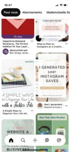
Keep in mind that a good amount of Pinners are usually browsing Pinterest from their phones. You need to use an easy to read font and some hierarchy in your text. This will help the information comes across naturally and quickly.
I know phone screens have increased over the years, but still, you need to create pins that will be easily understood with this type of layout:
Your Pinterest pin image needs to be easy to read because people have such a large choice of images that they won’t think twice before clicking on a pin. They’ll choose the one that seems to answer their questions the best. They have no time to try and decrypt what that cute little handwriting type font is actually saying.
Easy to read fonts and hierarchy in your text will make it easy for pinners to understand your Pinterest pins. If pinners understand your pins, they’ll more likely click on them!
3. Pay attention to your text overlay
This design tip is a continuation from tip number 2! In order to create a click-worthy Pinterest pin, you need to pay attention to what you write on the pin image itself!
Pinterest is a search engine and it relies on keywords to provide content to the users. If you want your pins to be clicked on they need to appear in the search results. And just like google, the higher on the page, the more chances you get for people to click on them.
Use Keywords on your text overlay
So, first thing first, you need to use keywords in your text overlay! Your text overlay is an opportunity to tell Pinterest what your pin is about. Once Pinterest understands your pin, it populates it in the results’ feed.
Your text overlay needs to be convincing
Secondly, your text overlay is an opportunity to convince your audience. You need to convince them that your pin is what they need! That this is the pin they should click on to get the answer to their question.
Your text overlay should be treated the same as your blog title: It should be short and to the point. It should also use keywords to convey what the user will get out of your content.
Your text overlay can, and definitely should on some of the pins, match your blog titles. However, this is also the place where you can try different wordings and keywords to see which ones your audience engages with the most.
4. Add a call to action on your Pinterest pins
You need to tell people what you want them to do. The easiest way to do so on the design of your Pinterest images is to add a call to action. In other words, you’re spilling out what you are expecting pinners to do once they see your pins.
Depending on your content, your call to action will be different. It will also give more context to the pinner which will help with the decision of clicking.
Here are some examples of call to action you can use:
- Read more on the blog
- Click to download your guide
- Watch the video
- Join us now
- Click to access the course
Bonus tip: Make sure your call to action is visible and will attract the attention of the pinners while they skim your pin!
5. Really think about the pictures you choose for your Pinterest pins
You don’t necessarily need to add a background picture on your pins but it’s always a good rule of thumb to have different pin design types.
If you’re not sure what I mean by a “background picture” take a look at these two pins:
The left image has a picture in the background, the right image has no picture in the background.
For the ones you use pictures (background) on, the choice of picture is actually very important. Why? Because Pinterest can read keywords on a picture. And I don’t mean text keywords (although it does, that’s not the point here), I mean actual objects on the picture from which they’ll extract a keyword.
If you’re publishing a chocolate cake recipe, for example, adding a picture of a chocolate cake will increase your chances of ranking for “chocolate cake recipe”.
If you’re adding a picture of a dog, you’ll just confuse the algorithm and your pin will have a low confidence level when it comes to the keyword “chocolate cake recipe”. Therefore, your Pinterest pin won’t be distributed as much in the results feed.
6. Make your Pinterest pins stand out
Think that your pin will be competing with thousands of others. In fact, the design of your Pinterest pin image is as crucial in your Pinterest strategy as your keywords because this is what will push people to choose YOUR pins over anyone else!
Designing your pins doesn’t have to be hard but you do want to think about how you can make it stand out from the competition.
There are plenty of free pin designs out there that you can use but be smart about it and make sure you personalized them so they don’t look like a copy of the template. You’d be surprised how many times someone uses a template without adding any personalization.
You have to keep in mind that Pinterest can “read your image” as mentioned in point 5. It means that not only can it read keywords from a picture, it can also pick up on colors and overall design which the algorithm uses to categorize your pins. The more your pins look like any other pins, the hardest it will be to step out of the crowd.
Check out this screenshot. I used the visual lens to see how Pinterest picks up on my pin and see what other “similar content” it’s populating:

One of my favorite tips when it comes to standing out with your pins is to actually buy templates. People don’t necessarily think about or dismiss it because they don’t want to spend money but think about it! Instead of only using the free templates everyone uses, even when personalized, you can find plenty of designs for a fair price that will help you stand out from the competition because they’re less used.
7. Brand your Pinterest pin designs
Our 7th tip to create click-worthy Pinterest pins is directly related to number 6! In order to make your pin stand out, you need to infuse your branding!
Increase your brand awareness
First, your branding is unique to your brand so it is important that your pins convey that.
Second, it will help with your brand awareness on Pinterest if people can recognize your pins! People who engage with your pins once are more likely to click and engage with your pins in the future so make it easy for them to spot your pins!
Get credit for your Pinterest pins
But, not only will it help with your brand awareness, but it’s also important to be able to track the origin of your pins. Just like on any other platform, your pins can be stolen, or someone might change the URL when saving your pins on their boards. People can still get back to the original content thanks to your logo/website URL added to your pin image!
Even if you bought pin templates, you still want to personalize them to fit your brand!
Your Pinterest pins need to be coherent with your landing page
Because, onto my third point, they need to make sense with the landing page people will be directed to! Why is that important you ask? Because Pinterest actually scans the landing page to check out keywords as well as the overall aesthetic of the page to decide on the ranking of the pins. Remember, the user experience is at the heart of Pinterest! People click on pins for a reason (they like the design + expect a certain content) and Pinterest likes to check that this is what they’ll get if they click on your pins.
8. Create multiple Pinterest pins for each piece of content
That being said it doesn’t mean you can’t experiment with your pin designs! Feel free to try out different colors and different designs! Just keep a certain coherence with your landing page (the style of your pictures for example, if you use light and airy pictures on the landing page, try to use the same kind of pictures on the pins).
That’s also a smart strategy to ensure that you get click-worthy Pinterest pins for three reasons:
Fresh pins
Pinterest clearly stated that repinning the same image over and over was not a viable option if you want to reach their audience. They actually want more brand new content (new URLs) and fresh pins for older content (same URL but different designs) so the users see a variety of pins. By creating multiple pins for the same content, you can spread the distribution of your content on Pinterest and still provide a good user experience.
You can appeal to different people
We all have different tastes and preferences when it comes to color, typography, picture style, and/or wording. You can use that to your advantage and create different styles of pins for the same piece of content with different wording (question, short title, longer title, different keywords, etc..) so you touch a wider audience.
Use the data to create more Pinterest pins your audience likes
By creating different styles, you’ll be able to determine which ones get more clicks from your audience. Using that observation, you can focus your pin creation on the ones you know your audience prefers which in return will make it easier for them to engage with and therefore bring you the results you desire.
If you want a range to get started: I usually create 10 pin designs for each of my (and my clients’) pieces of content that I spread over a few months.
9. It’s not all about the Pinterest pins images
Thinking that only the design of your pin matters when it comes to clicks would be a huge mistake!
You have to think that people are looking for something specific and they’ll click on the pins that they think will provide what they want! However, you don’t have that much space on an image to actually show them why they should choose you! This is why your Pinterest title and your description are as equally important as your image.
You want to make sure that your description tells them exactly what they’ll find if they click on your pins and how you can help them.
I know it might be confusing because we said your description and your title should use keywords so your pins can be found. Your description actually has a dual purpose, the SEO part for Pinterest and the “convincing part” for your audience! You need to tie in both of these aspects!
Here’s how I like to do it:
- 1. Bring up the problem using your targeted keyword.
- 2. Tell them how this piece of content will help them solve their problem using keywords as well.
- 3. Add your call to action by inviting them to learn more.
Here’s an example of a description you could use:
Tired of trying to do Pinterest marketing all alone and not see the clicks you were promised? I know using Pinterest to grow your business can be confusing, and a little disheartening, so I gathered my best Pinterest marketing tips in this blog! You’ll learn how to set up an optimized account and the exact steps you need to grow your traffic with Pinterest! Click to get started now!
BONUS TIP: Make sure what you promote is what they get!
I have one last tip for you and it might seem obvious but it is extremely important! I mentioned earlier in this blog that Pinterest will scan your landing page to check if it matches with your pins so it is extremely important that you do not use clickbait strategies and that you actually deliver on your promises!!
First, Pinterest might reduce the reach of your pins. They’d do that because they don’t fully understand what your landing page is about and why it doesn’t match your pin. But the main reason I am telling you that is because of your bounce rate. If pinners don’t like what they see, they’ll bounce out right away. That action sends a signal to Google that says “people leave quickly so the content can’t be that good” and that your website is not interesting enough, which will reduce your reach and your website ranking. You might get clicks from Pinterest with this kind of strategy but you’re not capturing any traffic. Worst, you’re even reducing your chances at traffic from google.
Bottom line, honesty is always the best road! Don’t oversell your pins and be true to what the users can expect and you’ll be sure to have click-worthy Pinterest pins!
Alright, that’s the round-up of my best tips to create click-worthy Pinterest pins! Creating pins for your content should be fun, so follow the rules but don’t forget to experiment with your designs! And if you’re ready to take your pin images to the next level, visit the Pin Template Shop!
Like this article? Share it on Pinterest!
Other Pinterest topics you might be interested in:
Leave a Reply Cancel reply
This site uses cookies to ensure you get the best experience. By using our website you agree to our Privacy policy and our cookies usage.
Got it, thanks!

[…] 9 Tips to Create click-worthy Pins […]
[…] Related: 9 Tips to Create Click Worthy Pinterest Pins […]