About me
I'm Domitille! I help service based businesses DIY their Pinterest marketing so they can create a sustainable visibility strategy for their business.
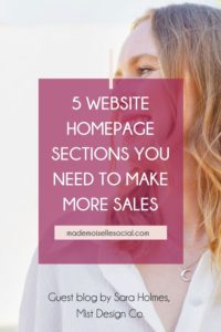
Is your website not converting as much as you’d like? Are you building your business website and are confused about what you need to include and in what order? In this blog, we are going to look at the five website homepage sections you need to make more sales and what you should include in each to take users on a journey from browser to paying customer.
Guest blog by Sarah Holmes, Brand Strategist, Designer & Founder of Mist Design Co.
Section 1: Header Section
This section is often referred to as “above the fold”. This concept originally came from newspapers, as their main headline is at the top of the page, making it visible on the newsstand when the paper is folded in half. On your website, above the fold is the section you see when the page loads, without scrolling.
Titles and headings
In this section, you have to instantly capture the attention of the visitor, otherwise, they won’t even bother to scroll. So how do you do that?
Make sure you answer, in simple terms, these three questions:
- What is your product or service?
- How could it improve the life of the person visiting your website?
- How can they buy it?
It’s fundamental that this part is crystal clear. It’s not a time to be clever, use a play on words or jampack your sentences with jargon that your ideal clients don’t understand. Simplicity sells. It’s as simple as that. Don’t forget, this is one of the most crucial website homepage sections!
Calls to action
Use two strong calls to action in your header. These should be buttons users can press to purchase your product or service – that’s what you want them to do, right?
One should be placed in the top right hand corner of the page and the other in the centre of the header section. Make the buttons bold and noticeable so they grab attention, by using capital letters, a bold font and a colour that stands out from the rest of the colours on the page.
Also think about the words you use on your buttons. Don’t make them vague, like “find out more”, instead try something like:
- Buy now
- Sign up
- Join the program
Avoid clutter
You don’t need to include every page on your website in the header menu. In fact, you can get rid of the About page and the Contact page and instead move them down to the footer menu.
As a rule of thumb, ask yourself the question “what do I want someone to do when they come to my site?”. Choose only one thing, and make sure everything on the homepage is leading them towards taking that action – in the case of this blog, we’re focusing on making more sales on your website.
Section 2: The Cost Of Not Buying
In this second section of your homepage, you want to highlight your ideal clients’ problems and struggles. What will happen if they don’t buy your product?
Questions to Ask Your Website Visitor
This doesn’t need to be extremely negative, but instead show them that they deserve more than they have at the moment and don’t have to go it alone.
For example, if you’re selling a coaching program for new entrepreneurs, you could ask:
- “Are you struggling to bag your first paying client?”
- “Do you find it difficult to show up on social media consistently?”
These are struggles your ideal clients have and want to solve.
If you are a company selling electric scooters, you might say:
- “Are you sick of sitting in traffic every morning?”
- “Wanting to avoid road rage?”
Whatever will speak to your ideal buyers, highlight it in question form so they think, wow, yes, that’s exactly what I want.
Show Empathy For Your Ideal Client
On top of that, your website visitors need to know you understand their difficulties. You wouldn’t hand over money for someone to solve a problem for you if they couldn’t even explain what the problem was, would you? If the words don’t relate to them, then they’re not going to buy from you.
If you are finding it hard to write this section, the best thing you can do is jump on a few market research calls with ideal clients and ask them directly what their problems are. There’s nothing more valuable than hearing it from the horse’s mouth.
You can also include another call to action button at the bottom of this section.
Section 3: The Success You Can Bring Them
In this part, we need to focus on our potential clients’ goals. What do they want to achieve? Or even more powerful than that – Who do they want to be?
Help your visitors imagine a better way of living
As human beings, it’s natural for us to daydream about the best version of ourselves and how we would be. Whether that means being fitter and healthier, more successful in our job or business, or pursuing a new hobby or interest and improving our skills in some area.
Again, this is something you can ask through market research.
Paint a clear picture of what life would be like when the problems you listed above are solved. How would they feel if they invested in your product and service? What person would they be?
Show empathy
As well as showing them what success looks like, this is also the section where you highlight that you really care. That your customers matter to you and you are committed to helping them achieve the results they want too.
You can say “we care!” or “I care!” and tell them why it matters to you so much. Have you been there yourself? Did you have the same struggles? Have you seen life-changing results for your past clients? Tell the person visiting your website!
Here, you are showing genuine care, but also positioning yourself as someone who is more than experienced and qualified to offer this potential client the help they need.
Only here can you start to mention yourself
It’s only in this section that you’ll start to mention yourself or your business. When someone comes to your website, they are thinking about themselves and what you can offer them, not wondering about who you are and what your story is.
Human nature is selfish and we think about ourselves first. Putting your about me section at the top of your homepage doesn’t help you make more sales (it just gives you a little ego boost ;))
Section 4: Your Product Or Service
In this part of the website homepage, you are going to introduce your product or service. Needless to say, this is one of the website homepage sections you definitely don’t want to skip!
Avoid overwhelm when it comes to the sale
This is the point where the person on your site will start to feel some resistance. Naturally, as they may have to get out their credit card!
They start to ask themselves, do I really need this? Will this really solve my problem? Will it be complicated and time consuming?
Lay out the plan visually
In order to calm those fears, you’re going to show a three step process to your product or service.
For example, if you are selling a product, it could be as simple as:
- You choose your product
- We prepare your order
- It arrives at your door
Lay out these three steps visually, using icons or numbers so your prospect has peace of mind that this isn’t going to be a purchase that overwhelms them. If it seems too complicated, they’re going to back away from buying from or signing up with you.
Section 5: Your Freebie
In this final part of your homepage, you are going to offer the person visiting something for free, often called a lead magnet. This one is definitely one of the most important website homepage sections for lead generation.
The benefits of a lead magnet
There are various benefits to this, including:
- Showing you are an expert in this particular topic
- You can benefit from reciprocity – which in sales psychology basically means giving someone something for free, meaning they feel inclined to pay you back
- You’re collecting your potential clients email address so you can land in their inbox and continue to build a relationship with them
What free resource should you offer?
Freebies can be anything from a downloadable template or how to guide, an invite to a live training, access to a video workshop, or anything else that you are willing to offer your potential clients for free.
Above all, consider how this freebie fits into your customers’ buying journey though. If you solve everything in the freebie, they’re not going to come back and buy from you. So bear in mind that your free resource should help them or give them a quick win, but ultimately lead them to purchase your paid product or service in the future.
And there you have it! These are the five website homepage sections you need to include on your website homepage to make more sales! Building a top-notch website isn’t only about the design and layout, but also using the right words and prompts in the correct places, so the person scrolling your homepage is convinced to buy. Follow this plan and you will be on your way to making more sales for your business!

LIKE THIS ARTICLE? SHARE IT ON PINTEREST!
Other topics you might be interested in:
Leave a Reply Cancel reply
This site uses cookies to ensure you get the best experience. By using our website you agree to our Privacy policy and our cookies usage.
Got it, thanks!


